My Blog List
Friday, May 6, 2011
Reverbed Achers assignment
While his work looks a bit weird, and might not be taken as seriously as he likes, Reverand Ethan Acres makes some interesting pieces of art. They could be considered pieces of junk, as he himself says he’s a thrifty person and tries to save money where ever he can, but that doesn’t necessarily mean he’s not an artist. One the one hand, He tries to get people to enjoy god and religion, usually avoiding fire and brimstone like sermons in favor of happier aspects of God and Christ, so to speak. While on the other, he does want his work taken seriously, as it’s meant to have his audience think and wonder about things, as he likes it when his art or sermons stir people up, as he says. Quite a few critics and artist think he’s poking fun at religion with his pieces, but he strongly denies this, saying he means no offense to his religion at all. He reminds me a bit of Richard Serra, both seeming to make pieces that want the “throw the audience off center” to intentionally make them view their world differently, or like the videos of Pipilotti Rist, both having pieces that start out, or are first seen as, fairly funny, but as the audience watches on, they see that there is a serious message and tone to thing. He does preaches different passages from the bible in different ways, such as locusts that have toy stinger missiles, dog tags, and military helmets and another with stitched together pink vinyl car seats into pigs with glowing red eyes and twitching tongues. While at the same time he does sermons that seem to be works of performance art, such as his one called Ultraman, where he preaches about another verse in the bible, yet replaces words and names with things from the T.V. show, making it relatable to something fairly modern to people so as to keep the attention of his congregation. He knows that he’s not a particularly popular artist or preacher, both worlds seeing him as too jolly, or maybe too “out there”, and he knows if he were to be as Buddhist, or turn to more traditional Christian preachings, he would be embraced easily by both of the worlds he walks in. But he prefers to do things his way, happily taking about his own short comings as opposed to demeaning others for theirs, most of the time counting himself among the sinners of the world for his occasional over indulgence in things, but still this makes him stand out, showing him off as one as a person who realizes his faults, admits them, then tries to help others either with memorable sermons or pieces of art made with twenty five plastic deer and Wal-Mart fans.
Big idea
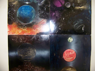
And here is my big idea project. A few different reasons why I went with this idea, the biggest being that this was one of the first serious attempts at art I tried several years ago. It was surprisingly well liked by the class, though a few people mentioned that there were some distracting elements on the different pictures. The man thing i wished I could have done different was changing up the subject matter. cool space scenes are interesting, but they're only interesting for so long.
Inflable.
Here is my group's inflatable project. it didn't quite turn out how I thought it would, but after only a week of work, it was at least fairly interesting. We didn't quite get the thumbs attached right, but it worked out mainly so that people could somewhat see what they were doing. The one thing I would want to improve would be to make it a bit smaller. Quite a few people had problems handling the thumbs, simply because the hands took up most of the space, and anyone under 5'5" weren't able to use it too well.
My metephor project.
So here is my metaphor project. The specific metaphor I went with was "When you fall apart, there's nothing left to do but to pick up the pieces". It was a fairly good idea at the time, but a few people felt that it was a bit too obvious solution.
Sunday, April 24, 2011
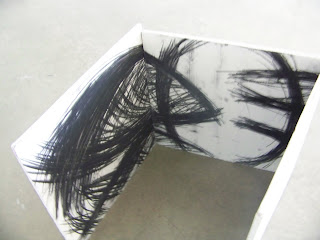
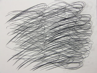
So here is my mark making piece. it is...very unfinished, even to me. Originally I wanted to make it a box of sorts, like a present almost, and have the audience look into it to get a better view of it. but, due to some serous material problems, that didn't happen, and I was left with this. One the one hand, though, Kathy did like the mark making I did on the stuff.
Monday, April 11, 2011
Exquisite Corpse
sooo....here is my wacky little peom
The Blue Kathy Paused the Beautiful Tree
The hilarious Table falls slim a cry
the Green Shot runs the Learning Balloon
The Blue Kathy Paused the Beautiful Tree
The hilarious Table falls slim a cry
the Green Shot runs the Learning Balloon
Sunday, April 10, 2011
Feminist pictures
Here are my feminist pics. I was thinking along the lines of things that are kind of stereotypically associated with being something a girl does or something of the kind.
Sunday, March 27, 2011
Picture for 2D piece
So...I can't quite decide between these two images, one sees too hard, but the other seems too easy...but bother are somewhat what I want....I do like the second one a bit better, simply because it has a person in it, like I wanted, so I might go with that one.
Monday, March 7, 2011
Map idea
I have an idea to make something out of text books along the lines of things from this video to map out my high school years, it may not be the biggest things, but I feel that it could be interesting.
MM photos!
So theses are some photos of my Modular Madness piece. I was kinda surprised that quite a few people liked it as much as they did.A few congratulated me on it simple for sticking with what I started with and not changing it in the middle of the project, which, admittedly, felt pretty good. And another happy accident that came from it's smaller size was that there was very little damage, if at all, done to it when I took it home.
Sunday, March 6, 2011
Research 1
A collage (From the French: coller, to glue) is a work of formal art, primarily in the visual arts, made from an assemblage of different forms, thus creating a new whole.
Assemblage is an artistic process in which a three-dimensional artistic composition is made from putting together found objects.
The term pop-up book is often applied to any three-dimensional or movable book, although properly the umbrella term movable book covers pop-ups, transformations, tunnel books, volvelles, flaps, pull-tabs, pop-outs, pull-downs, and more, each of which performs in a different manner. Also included, because they employ the same techniques, are three-dimensional greeting cards.
Thursday, March 3, 2011
Modular Madness
1. Sensitive use of materials: does the form of the overall piece respond to or resonate with
the objects chosen as modules?
The object took a bit of effort to work with, but after listening to it for a bit, I was able to get a good form for it.
2. Could the piece be made from another object just as well, or is there precise/necessary
correspondence between the objects and the structure?
While the general form of it could possibly be made with other card like objects, this one in particular really needed the dark, spiral side of the card and the colorful faces inside to complete the mystic look it has
3. Explain any material difficulties in usage?The cards really needed to be placed precisely, otherwise the whole thing would be off...which did happen to me a few times.
4. Meaningful discoveries?
I discovered how listening to your materials makes things a lot easier than forcing it. Granted, I experienced that with the cardboard, but it was more important and vital in this, at least it seemed that way to me.
PROCESS/AMBITIOUSNESS
1. Does the piece rise above the ordinary in terms of scale, materials or effort?
Considering the effort it took to stay on track, and be precise with the cards, I would say it rises fairly high above the oridnary in terms of effort.
2. How did the piece change from initial mental imaginings to final piece?At first, it was going to be much, much taller, and not close at the top, but because of time and difficulties, I had to cut it down and play with closing it.
3. Was the initial idea or final piece more ambitious? How so?
The initial piece was far more ambitious to me, since it would have been as tall as me, at the very least.
CRAFTSMANSHIP
Is the way the piece put together helping the overall effect or distracting from it (How so?)
I think it helps both with the general shape that makes the eye fallow the spiral form of the cards up, to the off set patterns of the lights.
FORM
What are the dominant formal elements (point, line, shape, color, texture, value, space) visible in the work? Are these elements important to the piece? In what ways?
light and shadow play a big part in it, while the color on the inside of the form comes in a close second.
What are the dominating principles (scale, hierarchy, repetition, rhythm, unity, contrast, balance, space, gravity, continuance, similarity/difference) visible or implied in the work? Explain how each dominating principle helps strengthen the impression of the work or detracts.
I used repetition a lot, making a pattern that draws the eye upwards as it fallows the cards around the form of the lantern. The same applied to making the holes in the sides to let the light filter through.
CONCEPT
Does piece relate to the source objects history, function or purpose? It might relate to the cards function or appearance in the TV show, but not in real life.
If so, how?
In the show, large pillars of light would shine up just before something happened when ever a card was played.
How does the presentation of the piece alter the viewers understanding of the source object? They didn't so much think of it differently, so much as remember it all the better and the good times that came with playing the card game.
PRESENTATION
Why here? because I really needed a dark space to show off the light
What is the relationship of the work to the space?
not much, other than the darkness needed to display the light
How do the surrounding elements impact the viewing and impression of the piece? it brings a slight....charm to the boys bathroom, if only a very small bit
Does the piece respond or ignore what is around it? How so?
it ignores it, calling more attention to itself with it's shiny lights.
Monday, February 28, 2011
Line revision
Here be my revised story...with a bit of a different view:
Wow….I can NOT believe what my brother did to me…Like, my day was going just. Fine. And he had to go and kinda ruin it…see, it was my birthday right? Heheh, was having an ok time, friends at school were all like “What’s up girl!!!!! Happy be daaaaaaaay!” And I was all like “Awh girl, thank youuuuu!” Yeah, it was good. Got a few dollars pinned to mah shirt too, making it raaaaaain~ But yeah, was just chillin’ at home right? He calls me, ‘bout to head up to Huntsville the next day, and while I’m talkin’ to a friend to both of us, he asked her “What’cha want for your birthday” Oh no….no wait….-She- asked me what I wanted for my birthday and he told her “Ask her if she wants another panda!”….Now…I know…he’s mah brathur….but no he didn’t. I KNOW he knows not to remind me about those things….right? Seroiusly, hate the boy who gave those to me….don’t wanna think about it at ALL, gawd….it’s just like….well whatever, ‘s long as he don’t do it again…crossed the line there boy….crossed. the. Line….anyways, I went to go see him the next day, we was cool. Hehe, we made fun of my mom a bit, all harmless stuff, but still…kinda still had me a bit mad he had me thinkin’ ‘bout that boy again…..hrm….did I eat lunch today? Ooooh, yeah, yeah, pizza…yummmm~
Subscribe to:
Comments (Atom)


